FIFA World Cup 2026 Brand Identity
FIFA World Cup 2026 Brand Identity Case Study | Public Address Studio
Explore the FIFA World Cup 2026 brand identity designed by Public Address Studio. Discover how a flexible visual system, custom typography, and modular design celebrate diversity across Canada, Mexico, and the United States.
One Identity. Many Expressions.
The FIFA World Cup 2026™ brand identity represents a significant shift in how global sporting events approach visual branding. Developed by Public Address and launched by FIFA in 2023, the identity was created for the largest FIFA World Cup in history-hosted across Canada, Mexico, and the United States, featuring 48 teams and 16 host cities. Rather than creating a static logo, the design team built a flexible identity system capable of celebrating the diversity, culture, and personality of every host city while remaining unmistakably FIFA.
The Challenge
Unlike previous World Cups hosted by a single nation, the 2026 tournament spans three countries, multiple cultures, languages, and visual traditions. The challenge was clear: Create a unified global identity. Allow individual host cities to express their own character. Build a scalable system that works across digital, broadcast, environmental graphics, merchandise, and fan experiences. Reflect the inclusive spirit of football on a continental scale. The solution needed to balance consistency with flexibility-a difficult task for an event that would be experienced by billions of people worldwide.
The Core Idea
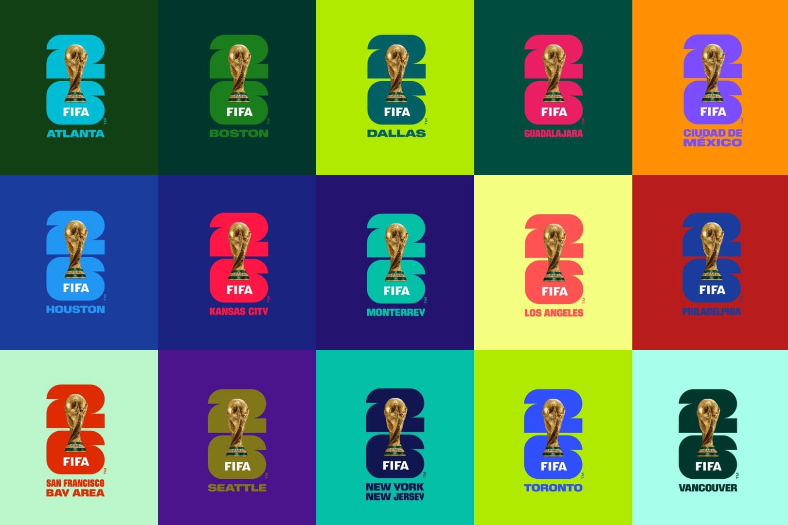
At the center of the identity is a simple but powerful concept: One identity. Many expressions. For the first time in FIFA World Cup history, the official emblem combines a photographic representation of the World Cup Trophy with the tournament year, “26”. This creates a recognizable visual anchor that can be adapted across countless applications and future tournaments. Rather than relying on a single fixed visual style, the identity behaves as a framework - one capable of evolving while maintaining brand recognition.
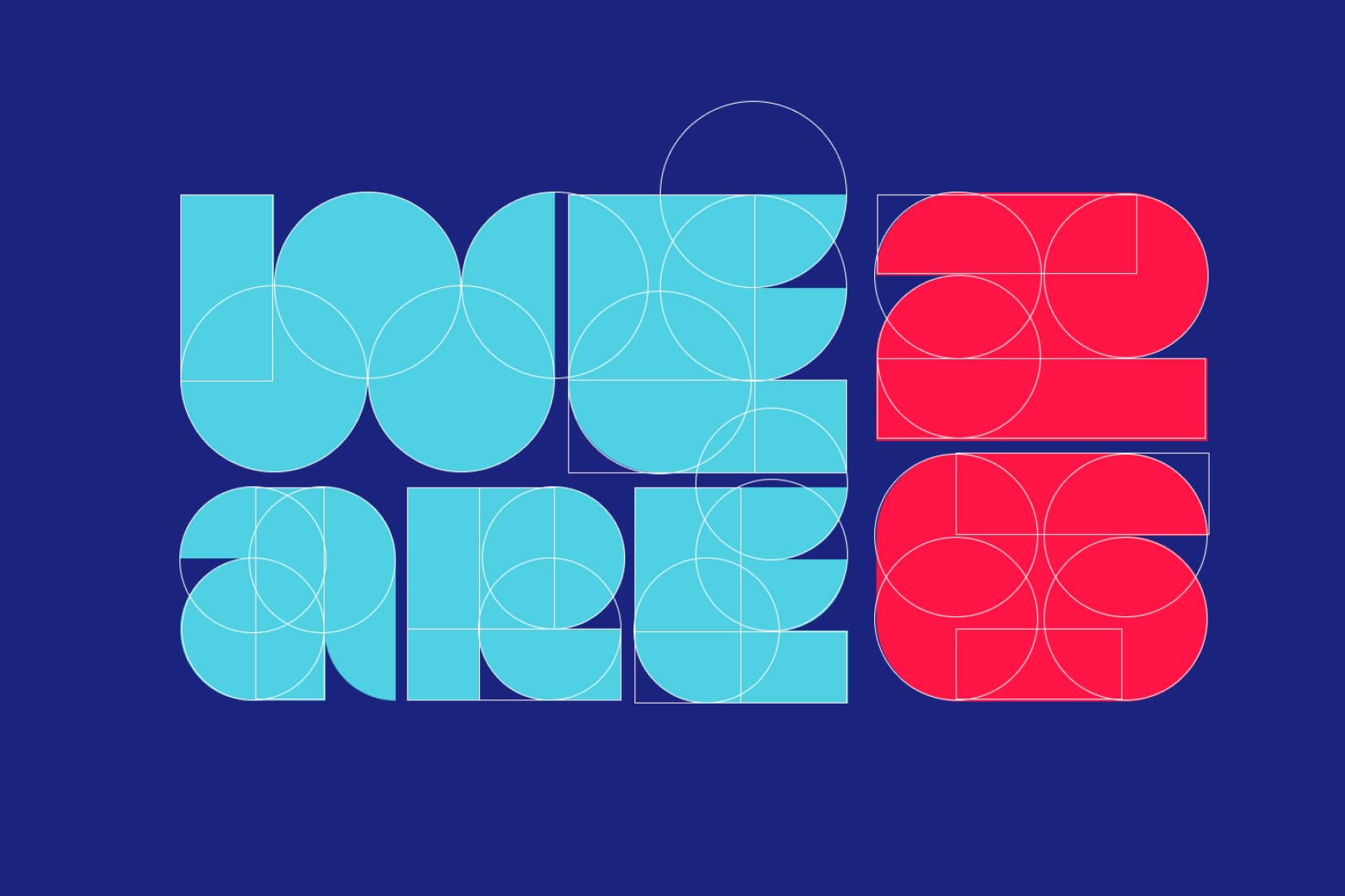
The Typography System
One of the most distinctive elements of the FIFA World Cup 2026 identity is its custom display typography. Built from simple geometric forms such as circles, rectangles, and rounded shapes, the typeface feels bold, approachable, and highly recognizable. The letterforms mirror the visual language of football itself: Dynamic movement Simplicity Accessibility Universal recognition The resulting typography creates a strong visual presence whether used in headlines, merchandise, social media graphics, or stadium branding. Its modular construction also supports endless visual compositions while maintaining consistency throughout the system.
A Flexible Visual Language
Rather than designing separate logos for each city, Public Address created a modular identity framework. The system combines: Bold typography Geometric shapes Vibrant color palettes Layered graphic forms Dynamic compositions This allows each host city to develop a unique visual expression while remaining connected to the larger tournament identity. The result is a branding system that feels alive-capable of adapting to different cultures, stories, and communities without losing coherence.
Why the Identity Works
The FIFA World Cup 2026 brand succeeds because it solves a uniquely complex design challenge. Instead of forcing three nations and sixteen cities into a rigid visual framework, it embraces diversity as a core design principle. Key strengths include: Scalability The system works across stadiums, broadcasts, digital platforms, merchandise, and environmental graphics. Recognition The trophy-and-year emblem creates an instantly identifiable visual anchor. Flexibility Cities and stakeholders can express their individuality without compromising the master brand. Cultural Relevance The identity reflects the multicultural nature of North America and the global football community. Longevity The design language establishes a framework that can influence future FIFA tournaments beyond 2026.
Design Takeaways
The FIFA World Cup 2026 identity demonstrates an important shift in contemporary branding: Modern brands no longer need to be rigid. The strongest identity systems today are often the most adaptable-providing structure without limiting expression. By combining a simple core idea, modular typography, geometric forms, and a flexible visual framework, Public Address created a brand that feels both unified and diverse, perfectly reflecting the spirit of the world's biggest sporting event.
Credits
Client: FIFA Brand Identity: Public Address Studio Campaign Platform: #WeAre26 Launch Year: 2026 Tournament: FIFA World Cup 2026 Images used in this article are for educational and commentary purposes to analyze the design system and visual identity of the FIFA World Cup 2026 brand.